
Jamie's Picks
1. Another Little Piece by Kate Karyus Quinn

I don't have a problem with the cover itself (I actually think it's REALLY pretty!!!) but I want something a little gorier looking instead of this pretty girl there. Something to reflect the strangeness of this story!
2. Something Like Normal by Trish Doller
 This is one of my most favorite books and the cover just makes it look like a romance (which I love) but this book is SO much more than this! I actually think it's a story some guys would dig but the cover totally is offputting to them. Travis is SUCH an amazing narrator. I don't know how I would redesign it but I would make it less of a kissing cover. Maybe the dog tag incorporated because I like that?
3. The redesigned Delirium series covers

I know these have already been redesigned but the face is just SO BORING. I would rather go back to what the old Delirium cover looked like. There's just nothing TO the cover here. It just lacks the spark and blends in with all the other face covers.
Paula's Pick:
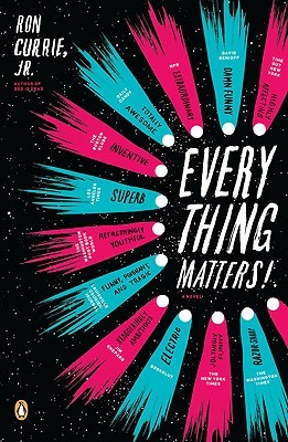
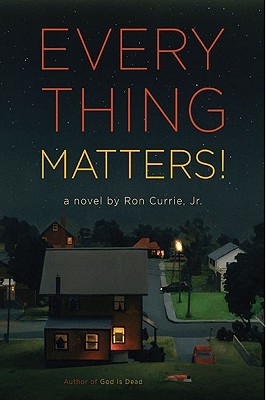
5. Everything Matters! by Ron Currie, Jr.
7. And while it's also not a "redesign" I would also love for the Harry Potter series to be released in a leather bound set. I have actually dreamed of owning one. And let me tell you how disappointed I was when I woke up and found that they are not a thing that exist.
There is concept art on the internet of House themed sets of the books. Come on JK do you know how many fans would buy these in a heart beat?
 Let me have a Ravenclaw set pretty please!
Bridget's Pick:
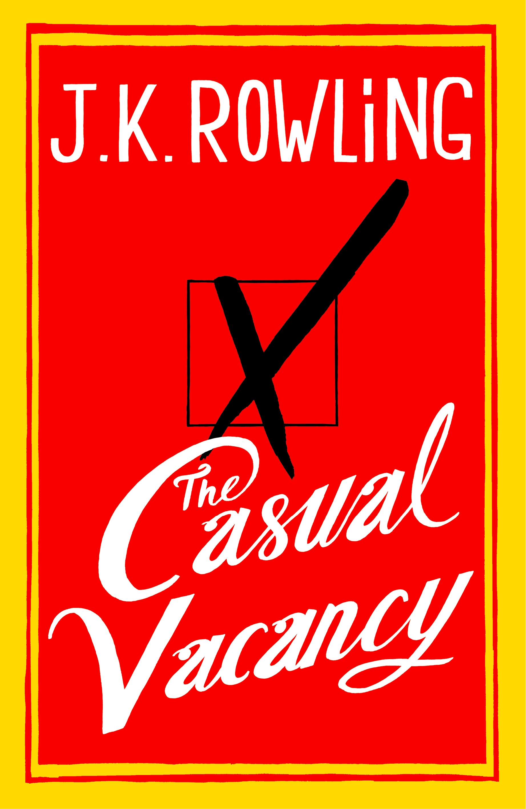
8. The Casual Vacancy


3. The redesigned Delirium series covers

I know these have already been redesigned but the face is just SO BORING. I would rather go back to what the old Delirium cover looked like. There's just nothing TO the cover here. It just lacks the spark and blends in with all the other face covers.
4. Any cover that doesn't reflect the MC -- like whitewashing or when it's an MC that is not a thin person yet the person on the cover is. I want them all changed.
Paula's Pick:
5. Everything Matters! by Ron Currie, Jr.
I am listing this as a case where a redesign was unnecessary. The original cover (on the left) is so much more eye catching to me. It was the one that made me pick up the book and go "hmm what's this..." where as I would walk by the redesign in a second. Which is a shame because I would walk by one of my favorite books without even giving it a glace.
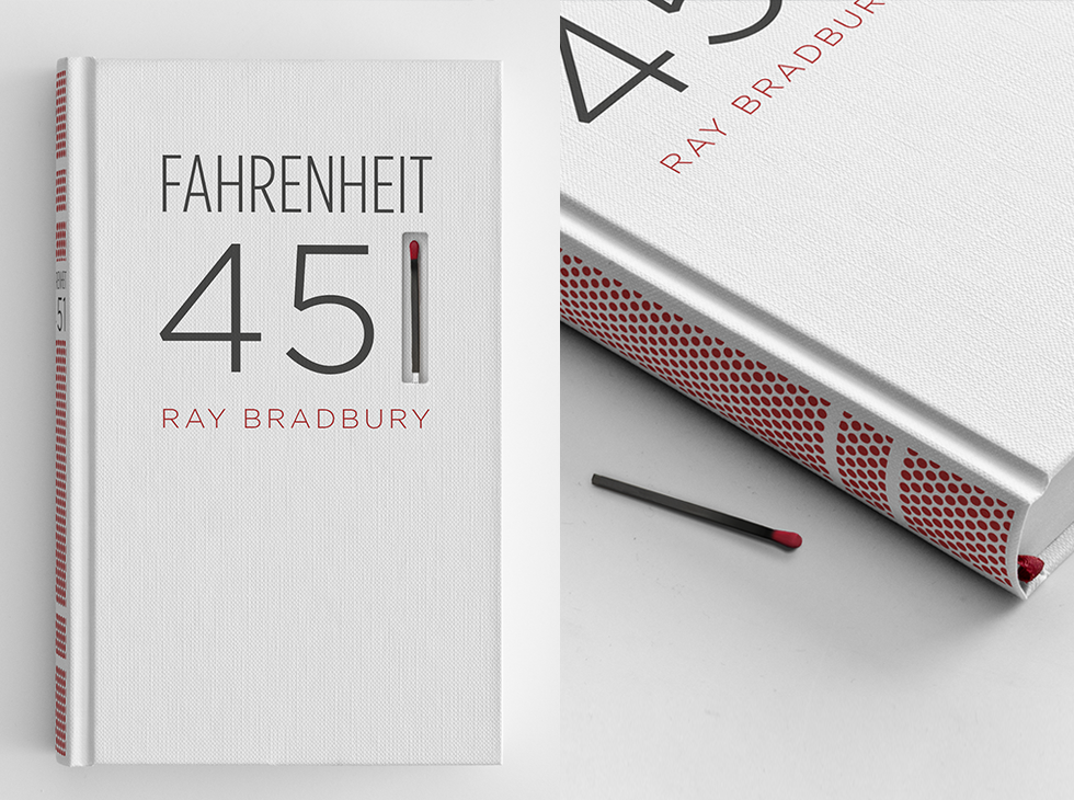
6. Fahrenheit 451 by Ray Bradbury
This is a redesign that I wish were real instead of concept art. Artist Elizabeth Perez designed this cover of Fahrenheit 451 that I saw on tumblr that I wish I could actually own. Man oh man it's beautiful.
7. And while it's also not a "redesign" I would also love for the Harry Potter series to be released in a leather bound set. I have actually dreamed of owning one. And let me tell you how disappointed I was when I woke up and found that they are not a thing that exist.
There is concept art on the internet of House themed sets of the books. Come on JK do you know how many fans would buy these in a heart beat?
Bridget's Pick:
8. The Casual Vacancy
I just find this cover kind of boring...I wish it had been something a little more engaging.
9. I also wish I could UN-redesign every book cover ever that shows a still from the movie made from the book when the original book cover was miles better (as it always is).
10. Tahleen's Pick:

I really hate this cover, especially because the book itself was so good. It's a historical fiction novel within a historical fiction novel; a girl in the 1960s travels back to the 1800s and is mistaken for a slave, even though she is white. Anyway, I think this cover probably has turned off at least a few people.
Do you agree with any of our picks? Disagree? Which ones do YOU wish you could redesign?
People would pay big dollars for an HP set like that. It looks like an actual set (perhaps that's what this design is based on) that was marketed as being in a fancy wooden box. But when the buyers got them, it was flimsy cardboard.
ReplyDeleteStephanie @ Inspiring Insomnia
Something Like Normal's cover was what made me read the story but yeah, it's about so much more than a romance.
ReplyDeleteI haven't read The Casual Vacancy but I'd change the cover, too.
Jamie, I totally agree with #4 on your part of the list! Whitewashing the cover drives me crazy! For better or worse, my students at my previous school (which was 80% black in population) would steer away from covers with white girls on the cover. If I had the chance to book talk it to them they would give it a chance but still...
ReplyDeleteI super dislike the Delirium redesign. The original cover was so gorgeous.
ReplyDeleteAlso totally agree with #7. If they did this, I would absolutely buy a third set of HP books to go with my original hardcovers and the new paperbacks.
Totally agree with 8 and 9 too. The Casual Vacancy cover is so boring and I hate the colors. And movie tie-in covers are the worst. The absolute worst.
Glad you agree! I hate that people who get interested in books because of movies are deprived of (what I think of as) the *true* book, untainted by Hollywood. =P
DeleteI agree with Jamie that cover needs to represent main characters or at least setting. When cover is too generic it gives wrong impression. And also with Bridge - Casual Vacancy is just awful and I hate it when they change book cover to fit the movie (I forgot to add that to my list).
ReplyDeletebtw Love the Fahrenheit 451 & HP idea. :)
I would buy that HP chest set in an instant! So much more interesting that all the close-up face covers that are out there...
ReplyDeleteI want a Harry Potter leather bound set too!!!
ReplyDeleteI love Everything Matters! What a wonderful book. I'd never seen the cover on the left before -- but you're right, the cover on the right doesn't really convey a whole lot about the book itself. Nice list!
ReplyDeleteLisa
The Casual Vacancy was one of my top horrible cover picks too. So boring, and so red unnecessarily so.
ReplyDeleteTotally agree about A Casual Vacancy. Super boring.
ReplyDeleteI am with you about movie tie-in covers! I hate those! The originals are always better and I hate for people to think the only reason I'm reading a book is because of the movie. And a leather bound set of Harry Potters would be heaven on a bookshelf! :-)
ReplyDeleteHi! My name's Day and I just participated in TTT! :)
ReplyDeleteAgreed, Delirium's cover is so boring. Movie tie-in covers are the worst, especially when it changes the cover of your e-book.
ReplyDeleteI think The Freedom Maze cover is pretty cool :p I've never heard of the book before and I'm going to add it to my wishlist :p
ReplyDeleteI forgot about the Something Like Normal cover when I made my list, but YES. It's not a good representation of the book at all.
ReplyDeleteI totally agree with the Casual Vacancy. It's just so boring - nothing to spark your interest. Another Little Piece has a deceptive cover - when I first saw it, I dismissed it as some generic NA book. The Delirium cover really was better as the original - the color scheme is so wrong for a dystopian.
ReplyDeleteIf I walked by The Casual Vacancy on a bookshelf and either didn't see that it was written by J. K. Rowling or didn't know who she was, I'd have no reason to pick it up. I imagine she probably counted on her popularity to draw people in, which is fine, but the cover still could have done with some more imagination.
DeleteI love that Fahrenheit 451 design too. I also hate when perfectly great covers get redesigned. Great picks, from all of you!
ReplyDeletenice picks. That's pretty cool about the Harry Potter Series. I'd still stick with the originals though.
ReplyDeleteI totally agree about The Casual Vacancy and Delirium. Great choices this week!
ReplyDeleteI love the F451 cover... simple yet effective. Not 100% sold on the wisdom of putting a match in a flammable book, but it's beautiful.
ReplyDeleteWhile I agree with the aesthetics of the movie-reprint book--hey look, actors--I like them for one reason. If a 'beautiful person' on the cover can get one person to read that usually wouldn't, isn't that a win?
You make a good point. I just dislike them personally, and am frustrated when a book I've read but don't own or a book I would like to read becomes a movie, and then I can't find an edition without actors on the cover. They seem to be more expensive, too, because they're all glossy and fancy.
DeleteI really love that F451 cover & the Harry Potter leather bound set! If only they were real...
ReplyDeleteThe Cuckoo's Calling. I don't get why the girl on the cover is white when the whole story revolves around a black model.
ReplyDeleteOh man, Delirium is on my list, too. I loved the creepy, hidden-behind-the-text picture on the original. The redesigns felt so blah in comparison. I love that idea for F. 451, though. So cool!
ReplyDeleteMy TTT: http://readthisinstead.blogspot.com/2013/11/top-ten-tuesday-book-redesigns.html
I did Delirium as one of mine too! I did my first ever TTT today and it was really fun :D
ReplyDeleteMy TTT: http://charliotherworld.blogspot.co.uk/2013/11/top-ten-tuesday-10-covers-i-wish-i.html
Charli x
P.S New follower! :)
Totally agree with all of these, but especially the Fahrenheit 451 and Harry Potter covers. I would buy both of those in a heartbeat!
ReplyDeleteFUN post, again, ladies! I agree with you Jamie - I've not read that novel by Trish, but the design could use a facelift. (I do like the type though.)
ReplyDeleteThanks for this prompt, I had fun with this one. I loooove the Fahrenheit 451 one, and I actually kind of like the Everything Matters redesign, in a way...
ReplyDeleteTotally agree with you when it comes to the casual vacancy!
ReplyDeleteHello, my name is Ericka and I just started the TTT. Im knew to blogging so this is really nice and easy to do. My TTT is http://highway-ya.blogspot.com/2013/11/top-ten-covers-we-wish-we-could-redesign.html.
ReplyDeleteI'm not such a fan of the Delirium cover either, especially the short story one!
ReplyDeleteI loveeee the fan-made cover for Fahrenheit 451, it's stunning!
Kyra @ Blog of a Bookaholic
My TTT post!
Agree with all of those, I hate ugly book covers! My TTT.
ReplyDeleteDelirium was on my list as well!
ReplyDeleteI agree that The Causal Vacancy cover need to be upgraded (especially since her other books have such nice covers)
ReplyDeleteDelirium: I am just so confused what is up with the plants on these covers. What designer was like, you know what will represent this story well: different kinds of plants next to faces!
ReplyDeleteGood picks! I agree about the movie cover stills - that bugs me a lot. And where do I get that Harry Potter leather bound set??? LOL! That TOTALLY needs to be a thing!
ReplyDeleteYES! I hate the new Delirium covers!!!!
ReplyDeleteJaime @ Two Chicks On Books
how about redisigns that you don't like? i am re-reading the Uglies&Pretties series with my students and the new edition's covers are just awful... the old edition was the "original" big face covers... but in the case of this series it really worked! so it annoys me a little...
ReplyDeletebut yeah, i think authors and publishers should be more careful when they create the look of a book. considering i am a person to totally pick up a book just because it has a pretty cover... it's worth something!
nice post! ^_-
The original *The Casual Vacancy* cover is lame, but I LOVE the new paperback covers. I almost want to buy one just because I like it so much.
ReplyDeletePaula, the first two Harry Potter books have leather bound editions. Sadly, none of the others. I own Sorcerer's Stone and I adore it. Like you, I wish they'd release the others or create a brand new one. I'd spend the money for it!
ReplyDeleteOMG could you please remove the other "Day" link at the list?
ReplyDeletejust joined the Top Ten link list!
ReplyDeleteHarry Potter covers are pathetic. Illustrator M.S Corley re-designed them as old penguin classics and they looked really good. Too bad it's just concept art.
ReplyDeletehttp://thebookhaven.wordpress.com/2012/11/13/harry-potters-books-in-penguin-classics-style/